Checkout Styling & Customisation
The Banxa Checkout can be visually aligned with your brand using the Style section in the Merchant Dashboard. Use these settings to create a seamless transition between your platform and the payment flow.
Settings Summary
The table below outlines which styling options are available in the Merchant Dashboard and which require Banxa configuration.
| Capability | Where It’s Configured | Notes |
|---|---|---|
| Logo Upload | Merchant Dashboard | PNG, max 70px height |
| Hide Banxa Logo | Merchant Dashboard | Enables "Native Mode" (removes logos/gradients) |
| Theme Preference | Merchant Dashboard | Default landing mode (Light/Dark) |
| Primary Colour | Merchant Dashboard | Buttons, highlights, and focus states |
| Secondary Colour | Merchant Dashboard | Hover states and Buy/Sell toggle; defaults to Banxa green |
| Background Colour | Merchant Dashboard | Requires Native Mode. Fixed hex code. |
| Logo Variants | Configured by Banxa | Light/Dark specific logos available on request |
| Font Family | Configured by Banxa | Supported Google Fonts whitelist |
| Border Radius | Configured by Banxa | Applies to buttons, inputs, and containers |
1. Style Settings (Merchant Dashboard)
1.1 Logo Upload
Upload your brand logo (PNG, max height 70px).
- Default: Your logo appears in the header when branding is enabled.
- Variants: If you require different logos for Light and Dark modes, please contact Banxa support to configure these paths manually.
1.2 Hide Banxa Logo (Native Mode)
Toggle: Hide Banxa Logo When enabled, the checkout enters Native Mode. This removes the Banxa logo, your partner logo, and the default background gradient.
Note on Native Mode: When the logos are hidden, the checkout background becomes transparent by default. In this mode, the theme (Light/Dark) is determined by the user's system settings and cannot be forced by the merchant.
1.3 Primary & Secondary Colours
- Primary: Used for main action buttons and active states.
- Secondary: Used for button hover states and the "Buy/Sell" toggle. If left blank, this defaults to Banxa Green.
- Consistency: These colours apply to both Light and Dark modes. Ensure your chosen hex codes have sufficient contrast for both backgrounds.
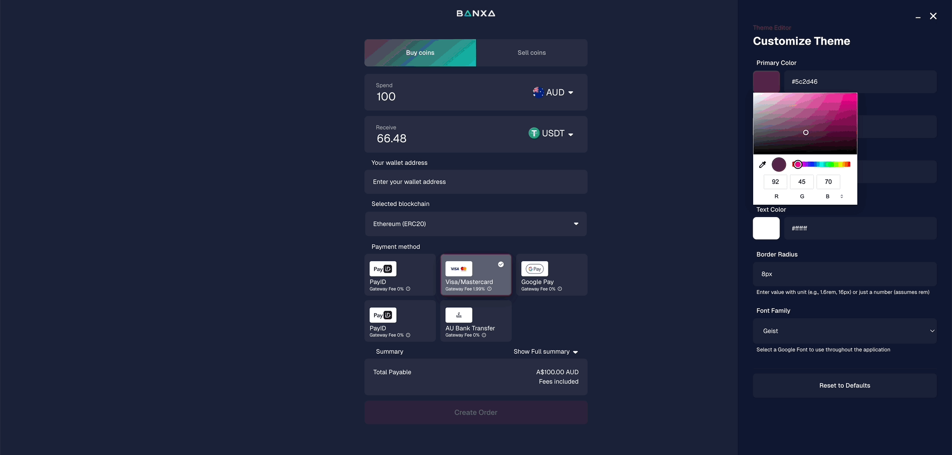
Primary and Secondary Colours
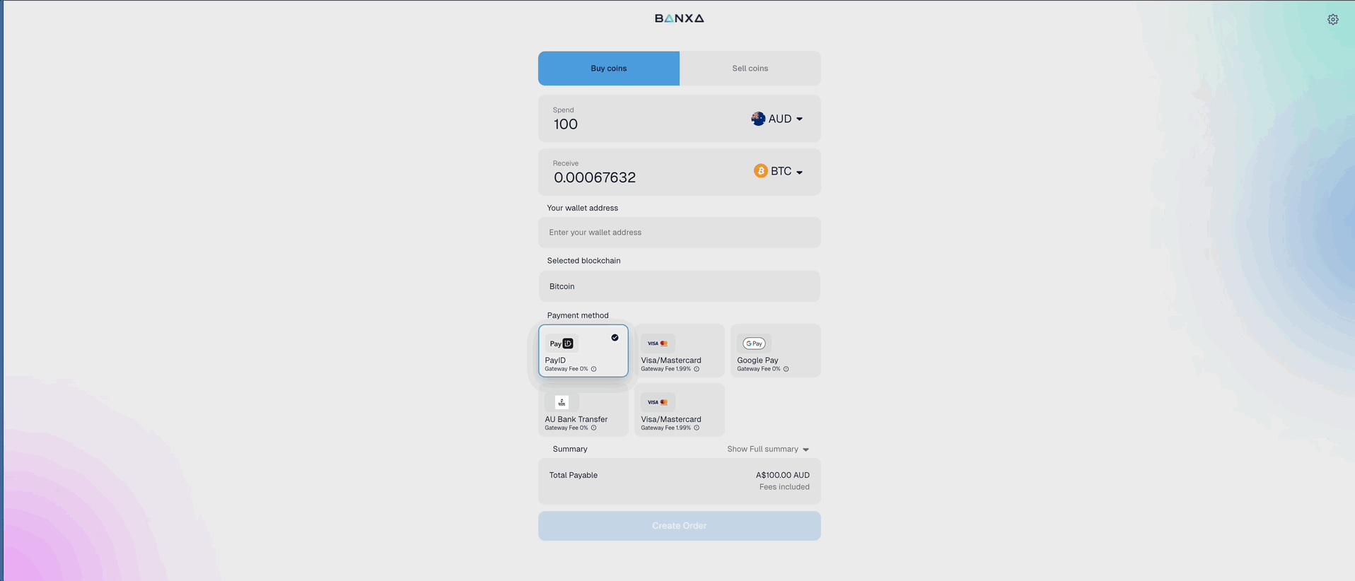
2. Theme Behavior & Compatibility
To ensure a stable user experience, please note how different settings interact.
Scenario A: Banxa Branded (Default)
- Behavior: You can set a default landing mode (Light or Dark).
- User Choice: Users can manually toggle between Light and Dark modes.
- Fallback: If no preference is set, the checkout defaults to Dark Mode.
Scenario B: Native Mode (Hide Logo)
- Behavior: Background becomes transparent.
- Control: The merchant cannot force a Light or Dark default; the UI follows the user’s system/browser preference.
- Restriction: Manual theme switching by the user is disabled to maintain UI stability.
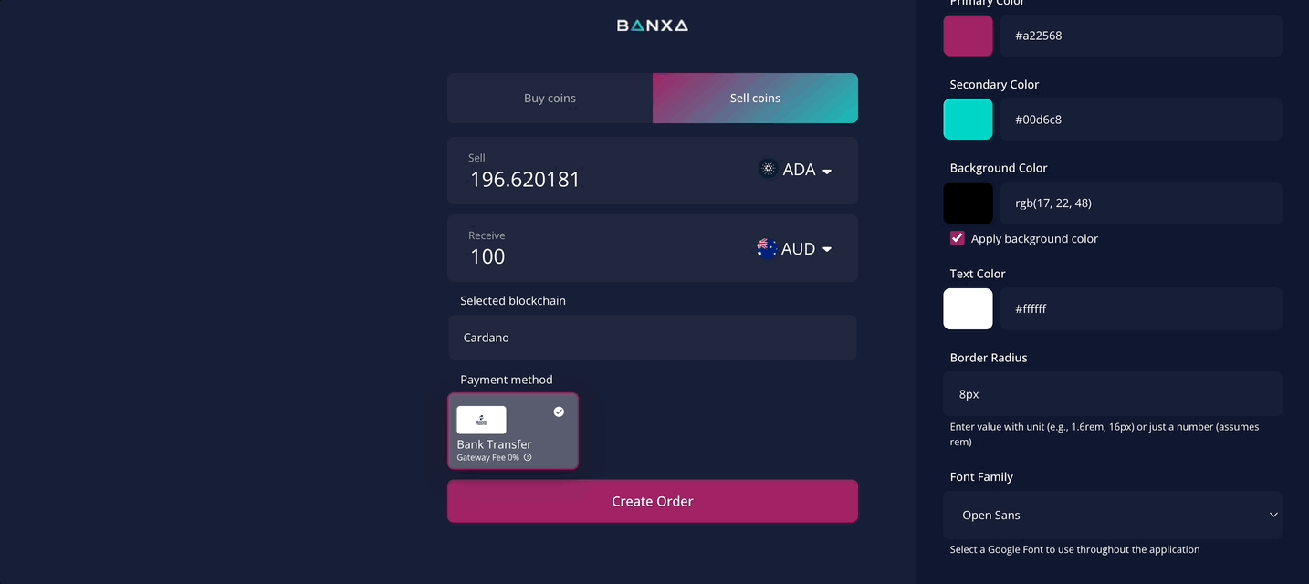
Scenario C: Custom Background + Native Mode ⚠️
- Warning: If you set a Custom Background Colour while in Native Mode, the background is static. It will not change if the user’s system switches between Light and Dark modes.
- Visual Risk: Because UI elements (text, inputs) may still react to the user's system theme while your background remains fixed, we recommend testing your custom colour against both light and dark text using the Theme Editor.
Dark and Light Mode
3. Design Best Practices
- The "Goldilocks" Hex Code: Since Primary and Secondary colours currently apply to both Light and Dark modes, choose a hue that is legible on both white and near-black backgrounds.
- Transparency: Always use a PNG with a transparent background for logos. A white "box" around your logo will be visible and look broken in Dark Mode.
- Check Your Contrast: Ensure your primary button text (usually white) remains readable against your primary brand colour.
4. Advanced Styling & Developer Tools
Advanced Styling (Via Banxa Support)
The following features are currently configured by our team upon request:
- Font Family: Choose from our Google Fonts whitelist (e.g., Inter, Roboto, Montserrat, Poppins).
- Border Radius: Define the "roundness" of your UI (e.g., 4px for sharp edges, 20px for a rounded look).
Developer Tool: Theme Editor
To preview these settings safely, append ?themeEditor=true to your checkout URL. This allows you to experiment with colours and radii in a real-time sandbox without affecting your live production environment.
Font Family Selection
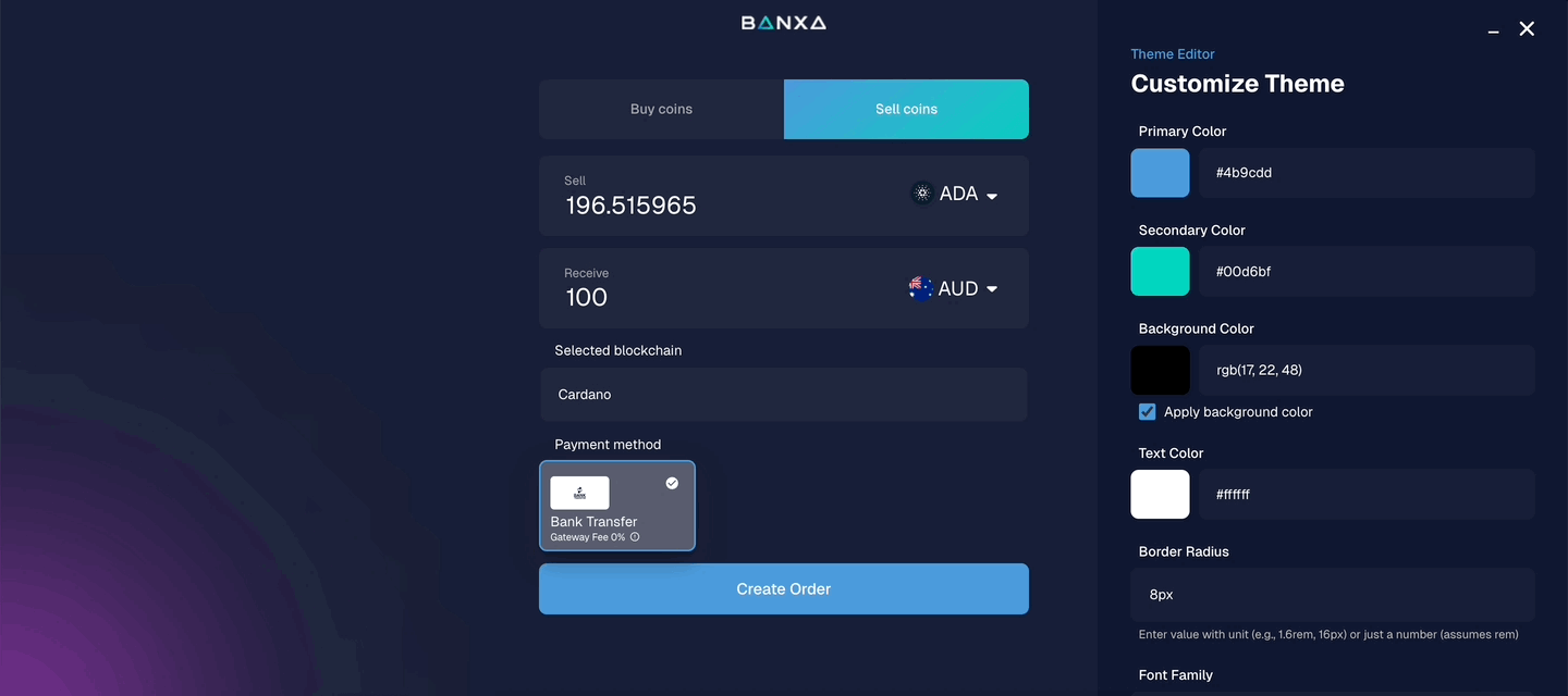
Border Radius in px
5. Looking Ahead: Enhanced Customisation
We are continuously working to give you more granular control over your checkout’s visual identity.
Coming Soon: We are developing updates that will provide even greater flexibility for advanced theming. This includes more independent control over how primary and secondary colours, backgrounds, and themes interact, allowing for a more seamless "Native" experience that automatically adapts to your specific brand requirements.
Updated about 1 month ago