Style Guide
These styling options allow you to configure the look and feel of the checkout experience to best match your application.
| No. | Color | Example | Description |
|---|---|---|---|
| 1 | Primary color | 4287f5 | Used throughout the app for headers, active buttons and loading icons. |
| 2 | Secondary color | 111e2b | Used throughout the app for button hover over effects. |
| 3 | Text color | 000000 | Used as the color for labels and input text. |
| 4 | Background color | ffffff | This can be a solid background color applied to all pages of the checkout journey. |
| 5 | Theme | Dark, Light | This can be used to defined the Banxa custom Light or Dark theme. |
| 6 | Logo | fileName.png | PNG file 70 pixels in height. Please provide logo for both dark and white theme background or the vector design of the logo. |
🎨Color guide
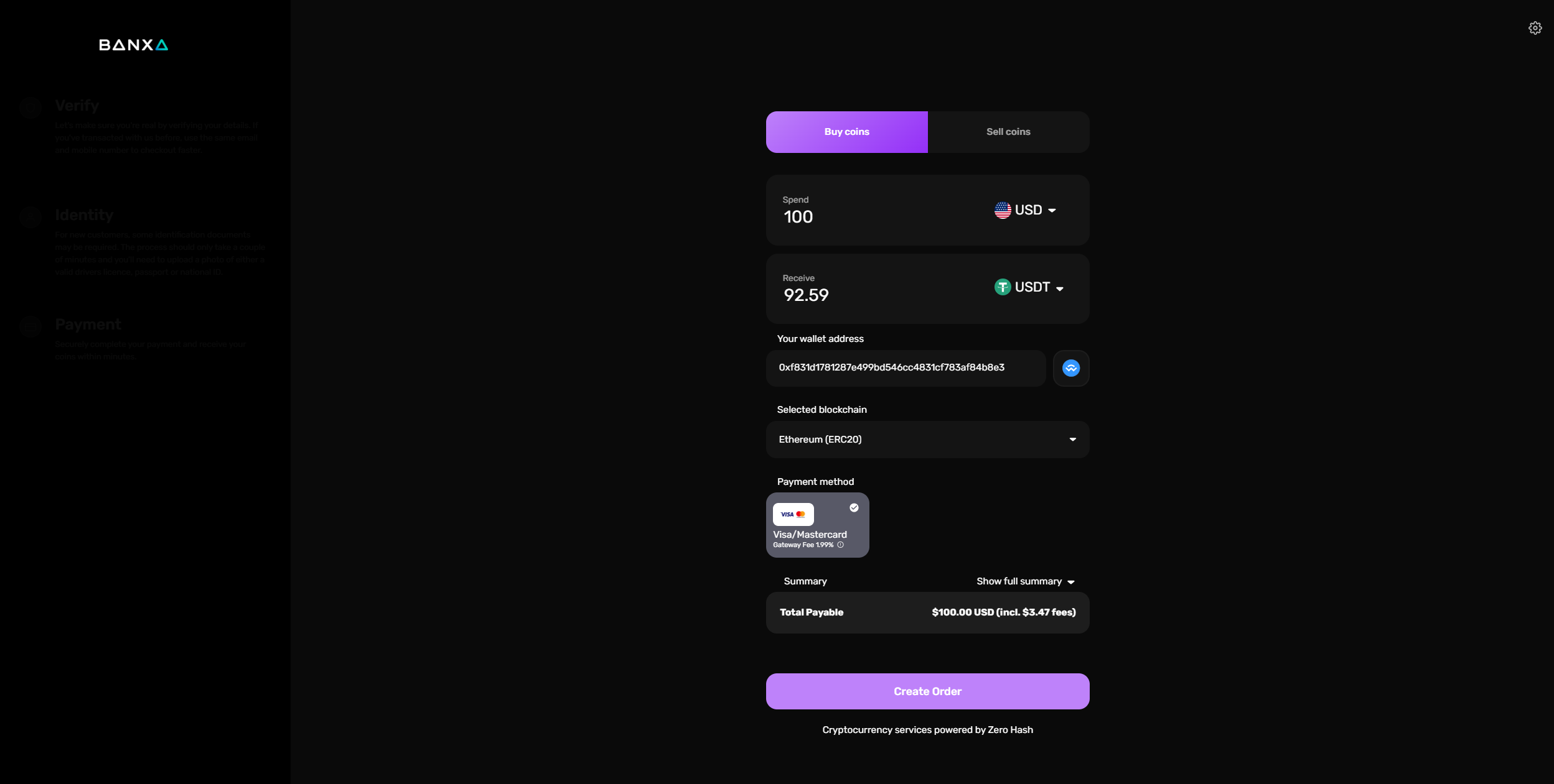
As an example, the below screenshot shows a solid background set as black (#000000), a primary color set at purple (#e014c2) and text color set at white (#ffffff).
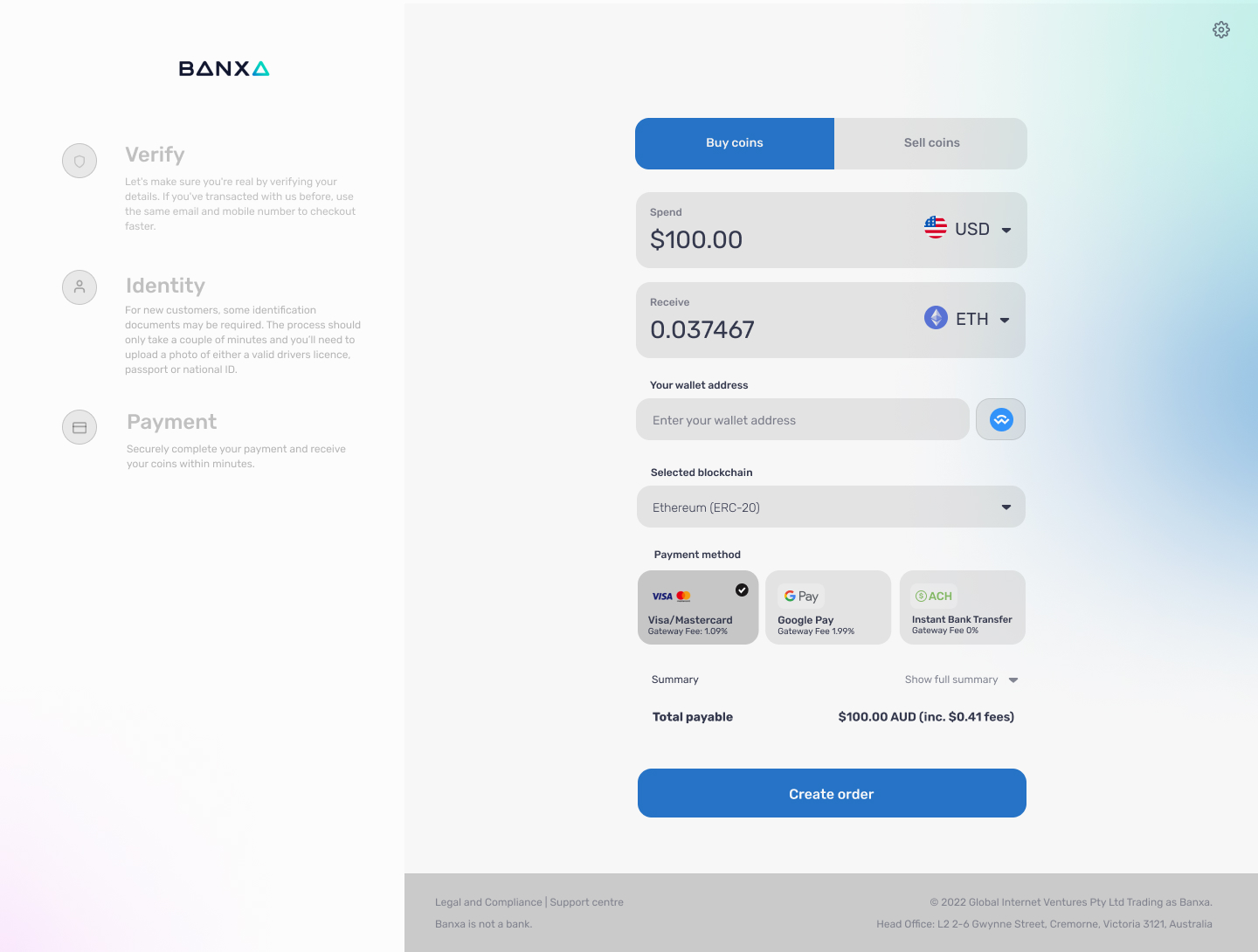
🌒Theme
Banxa light mode
In addition to setting the theme for the user, the user will also be able to change between light and dark mode via the settings button on the to right hand side. You can try it out here: https://checkout.banxa.com/
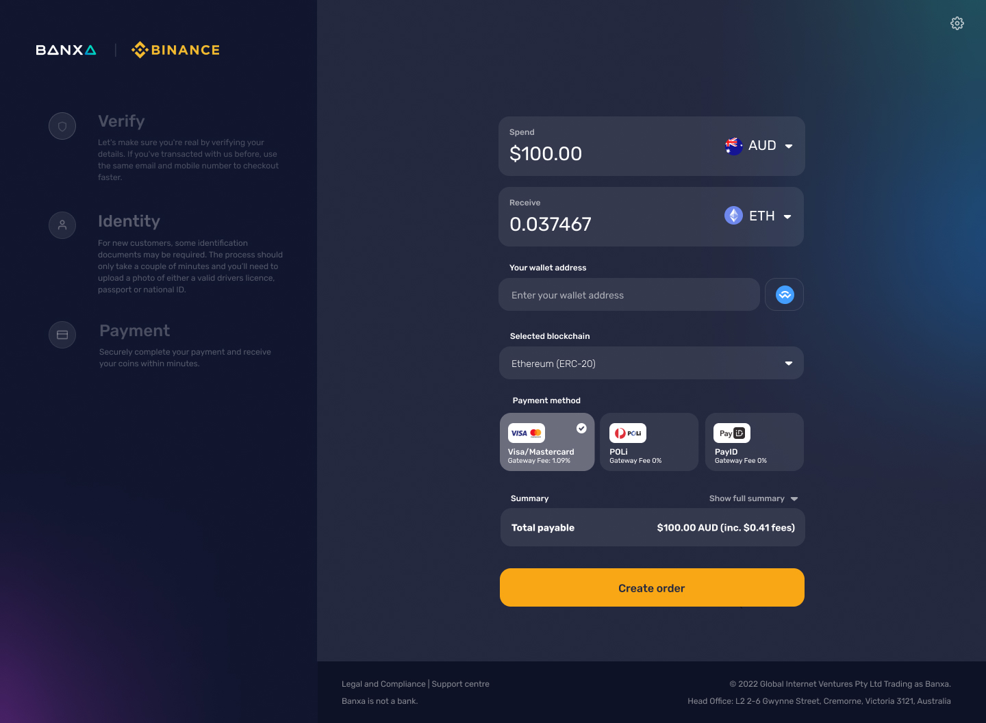
Banxa dark mode
This is the custom Banxa dark mode with a Binance logo.
Updated over 1 year ago